Week 15: Forecasting II: Linear Trend & Regression
This week’s big question: moving averages and smoothing always lag a trend. When the data is clearly climbing (or falling), how do you forecast the trend itself, and how do you predict one quantity from another, like a program’s enrollment from the county’s unemployment rate?
Before the week
- Read: Taylor, Introduction to Management Science (13e): Chapter 15, “Forecasting,” pp. 737–742 and 750–759 (focus: adjusted exponential smoothing and seasonal factors, then linear trend and linear-regression forecasting; interpreting fit / R², which the book calls the coefficient of determination).
- Warm-up self-check, slopes, lines, and exponential smoothing:
Reminder. The final exam. This is the last week of new material. Week 16 is review, and the cumulative final (20 pts) follows in the Dec 14–18 examination period. It reaches Weeks 1–15, so this week’s forecasting material is in the pool too.
Session 1: Mon, Nov 30 · Trend, season, and fitting a line (TBD)
🧩 Puzzle
The program that keeps growing. A community college runs an evening certificate in bookkeeping, and over the last eight quarters its enrollment was 120, 128, 135, 141, 150, 158, 163, 172, a steady climb. The program coordinator has to plan next quarter’s sections now. A moving average would forecast below the trend every time. How do you forecast a number that keeps rising?
Build the skill 1: the two patterns a plain smoother misses
A moving average uses the mean of recent observations as its next forecast. Simple exponential smoothing updates the previous forecast by blending it with the latest observation:
\[F_{t+1} = \alpha A_t + (1-\alpha)F_t.\]Here \(A_t\) is the actual value in period \(t\), \(F_t\) is its forecast, and \(\alpha\) is the weight on the latest actual value. The remaining weight stays on the old forecast. Neither method explicitly models trend or season; both need an extra component to represent those patterns.
A trend leaves the forecast behind. Start with \(F_1 = 120\), the first quarter’s enrollment. At \(\alpha = 0.5\), each update gives equal weight to the latest actual value and the old forecast; for example, \(F_3 = 0.5(128) + 0.5(120) = 124\). The widget runs that update through all eight quarters. Its second dial, \(\beta\), opens at 0, so it starts with plain smoothing. Watch the forecast sit below a climbing series:
At \(\alpha = 0.5\) and \(\beta = 0\) the next forecast is 164.33 while the program just enrolled 172, and every forecast from quarter 2 on came in under the enrollment it was forecasting. The smoother is averaging history, and history is lower than now. Adjusted exponential smoothing fixes this by carrying a second running quantity, a trend factor \(T\), and adding it to the ordinary forecast.
Work one update before reading the general rule. The quarter-2 base forecast is \(F_2=120\); initialize its trend estimate at \(T_2=0\). After quarter 2’s actual of 128 arrives, the next base forecast is \(F_3=124\). With \(\beta=0.3\), retain 70% of the old trend (zero) and take 30% of the new forecast movement (4 students): \(T_3=0.3(124-120)+0.7(0)=1.2\). Add that trend to the base forecast: \(AF_3=124+1.2=125.2\) students. The two updates, repeated each quarter, are
\[T_{t+1} = \beta\,(F_{t+1} - F_t) + (1-\beta)\,T_t, \qquad AF_{t+1} = F_{t+1} + T_{t+1}.\]\(T\) is a smoothed estimate of how much the forecast itself is moving each period, and \(\beta\) says how quickly that estimate reacts. Slide \(\beta\) up. At \(\beta = 0.3\), the setting Taylor’s own example pairs with this \(\alpha\), the forecast rises to 170.68 and MAD (mean absolute forecast error) falls from 12.67 to 9.36; at \(\beta = 0.9\) it reaches 171.88 with MAD 7.53. The widget scores MAD over quarters 2 to 8 at every setting, so those comparisons are fair. At this \(\alpha\) the lag shrinks but never closes: even the fastest trend dial forecasts next quarter below the 172 the program already has, because the correction is still built from past movement. (Raising \(\alpha\) narrows the gap as well, but a smoother that follows the latest quarter closely also follows its noise.)
A season makes the average wrong in a predictable rhythm. Enrollment shows no season: students stay for several quarters, so the head count climbs steadily even though new students arrive unevenly. The program’s inquiries are another matter. The office logs every inquiry from a prospective student, and over the last three years the quarterly counts, in tens (so 26 means 260 inquiries), ran 12, 18, 26, 16 · 14, 21, 30, 19 · 16, 24, 34, 22. Summer (Q3), when people plan for the fall term, towers over winter (Q1) every year, so any single flat number is wrong four times a year.
The repair is a seasonal factor for each quarter: its share of the grand total across all the years you have. Q3 takes \((26 + 30 + 34)/252 = 0.357\) of the three-year total, Q1 only \((12 + 14 + 16)/252 = 0.167\). The four factors sum to 1 by construction, which is the arithmetic check to run before you trust them. Then forecast next year’s total (inquiries grew 72 → 84 → 96, so 108 is the natural next) and split it by the factors: Q1 \(= 108 \times 42/252 = 18\), Q2 \(= 27\), Q3 \(= 38.57\), Q4 \(= 24.43\). Those four sum back to 108, and the forecast now has the same shape as the history instead of flattening it.
The two adjustments answer different questions: a trend factor follows growth, and seasonal shares allocate a yearly total across quarters. Return now to enrollment, whose eight observations show a steady climb. A fitted line estimates that climb directly.
Build the skill 2: draw the best straight line through the data
A linear trend fits a straight line \(y = a + b\,t\) to the data by least squares: the line that makes the total squared miss as small as possible. Its slope \(b\) is “how much per period,” the intercept \(a\) is the fitted starting value at \(t = 0\), and you forecast the future by reading the line forward. Press Fit trend line and watch the line, its equation, and the next-quarter forecast appear:
The fitted line forecasts 178.93 for quarter 9, above the latest enrollment of 172; the adjusted smoother at the illustrated setting forecasts 171.88. The line represents a continuing climb explicitly. A higher forecast is not proof of better forecasting: quarter 9 has not happened yet, and a fair accuracy comparison would use forecasts made before each evaluation quarter.
What makes a fitted line “best”? At quarter 4, this line predicts about 142.20 students and actual enrollment is 141. The vertical gap, \(141-142.20=-1.20\), is a residual. Squaring makes that gap positive, about 1.44 students squared. Least squares chooses the slope and intercept that minimize the sum of these squared gaps over all eight points.
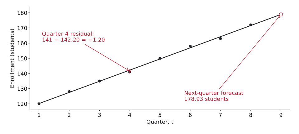
The gap is measured vertically because enrollment is what the line predicts. The following arithmetic finds the line you see here.
Where 112.82 and 7.35 come from. Least squares has a closed-form answer built from four sums. Number the quarters \(t = 1\) to \(8\) (they add up to 36), then total the enrollments, the products \(t \times y\), and the squares \(t^2\):
| Quarter \(t\) | 1 | 2 | 3 | 4 | 5 | 6 | 7 | 8 | Sum |
|---|---|---|---|---|---|---|---|---|---|
| Enrollment \(y\) | 120 | 128 | 135 | 141 | 150 | 158 | 163 | 172 | 1,167 |
| \(t \times y\) | 120 | 256 | 405 | 564 | 750 | 948 | 1,141 | 1,376 | 5,560 |
| \(t^2\) | 1 | 4 | 9 | 16 | 25 | 36 | 49 | 64 | 204 |
With \(n = 8\) quarters the means are \(\bar t = 36/8 = 4.5\) and \(\bar y = 1{,}167/8 = 145.875\). Taylor’s least-squares formulas take the sums and the means:
\[b = \frac{\sum ty - n\,\bar t\,\bar y}{\sum t^2 - n\,\bar t^{2}}, \qquad a = \bar y - b\,\bar t.\]The slope’s numerator measures how strongly \(t\) and \(y\) rise together, and its denominator how spread out the quarter numbers are. With this week’s sums:
\[\begin{aligned} b &= \frac{5{,}560 - 8(4.5)(145.875)}{204 - 8(4.5)^2} \\ &= \frac{5{,}560 - 5{,}251.5}{204 - 162} = \frac{308.5}{42} = 7.345 \end{aligned}\] \[a = 145.875 - 7.345(4.5) = 112.82\]So the line is \(y = 112.82 + 7.35\,t\), the equation the widget printed. The slope says enrollment has grown by about 7.35 students a quarter. The intercept is the line’s value at \(t = 0\), the quarter before the data begin: a fitted starting point, not a count anyone took. A forecast is then one substitution, \(112.82 + 7.345(9) = 178.93\) for quarter 9.
Build the skill 3: how well does the line fit, and what does it mean? (r and R²)
A line can be drawn through any data; the question is whether it fits. Two numbers report that.
The correlation coefficient \(r\) runs from \(-1\) to \(+1\) and carries both the direction and the strength of the relationship: \(r\) near \(+1\) is a tight upward line, \(r\) near \(-1\) a tight downward line, \(r\) near \(0\) little linear association; a curved relationship can still be strong. The coefficient of determination \(R^2 = r^2\) then always sits between \(0\) and \(1\). It keeps the strength but drops the sign, so a steep downhill line and a steep uphill line can both have \(R^2 = 0.95\). (Watch for this once your predictor is a real driver that can move the opposite way, like the program’s tuition: a strong negative relationship still gives a high \(R^2\).)
\(R^2\) is the share of the ups-and-downs the line explains. Near 1 means the points hug the line; near 0 means the line tells you little. The widget reports \(R^2\) alongside the equation. Here it rounds to \(R^2 = 1\) on screen (the exact value is \(0.998\), from \(r = 0.999\)), almost a perfect line.
Say it in one sentence (this is exactly what gets graded). Translate the two numbers into plain English:
- Slope: “each additional quarter adds about 7.35 students to predicted enrollment”. The slope is the change in \(y\) per one-unit change in \(t\), in the real units of the problem.
- \(R^2\): “the line explains about 99.8% of the variation in enrollment; the remaining 0.2% is noise or other factors.” That
X% explained, (100 − X)% left overtemplate is the canonical reading of \(R^2\).
A slope with units describes the fitted relationship; \(R^2\) measures its fit to these observations. To defend a forecast, also check timing, residual patterns, and whether the relationship is likely to continue.
In practice: a trend line is a promise the future may not keep
- Extrapolation is risky. The line assumes the trend continues. Forecasting 10 quarters out, or through a policy change or a recession, can be badly wrong. The further you extend, the shakier it gets.
- A trend line keeps the SAME slope even after the real trend bends. This is the deeper version of the point above: if the program saturates, a recession hits, or admissions caps the class, the slope itself becomes wrong, not just the far-out points. The line happily keeps climbing at 7.35 students a quarter long after reality has flattened, so a structural break breaks the model near-term, not only at the horizon. That limits a plain trend line to short forecast windows.
- Look at the residuals. The residuals are the misses (actual − fitted). If they curve or fan out, a straight line is the wrong shape. And if they cycle up and down on a yearly beat, high every Q3 and low every Q1 the way the program’s inquiries do, the line is missing a seasonal pattern. A straight line cannot see seasonality; residuals that swing on a regular beat are the tell.
- R² isn’t everything. A high \(R^2\) on a short, smooth series can still mislead; few data points = a fragile fit, and the same \(R^2\) says nothing about whether you should be extrapolating at all.
Back to the puzzle
The trend line is \(y = 112.82 + 7.35\,t\) with \(R^2 = 0.998\), so it forecasts about 179 students for the next quarter (\(t = 9\)), keeping pace with the climb where the smoother could not: the adjusted smoother’s best was 171.88, still below the 172 the program already has. In words: enrollment is rising about 7 students a quarter, and the line explains nearly all of the variation, so the coordinator can plan next quarter’s sections for about 179 students. But that only holds if enrollment keeps growing linearly; the moment the program saturates, the slope is stale and the line over-promises.
In-class group practice (wrap-up)
To close Session 1, fit a trend line by hand in your group.
Write every member’s name on the sheet. You have 15 minutes for the practice, then two minutes to photograph your group’s own attempt before the solutions are shown. One member uploads the photo to Canvas by the end of class; participation credit is for attempting the work.
The instructor uses the final eight minutes to demonstrate the handout’s method, check the main results with units, and explain a common mistake. This demonstration closes the session.
- Download: Week 15 group practice (Word)
Session 2: Wed, Dec 2 · Regression: predicting from a related variable (TBD)
🧩 Puzzle
Same program, new question. Monday’s line knows only the calendar: it says 179 because enrollment has climbed about 7 students a quarter. The coordinator has a hunch about why it climbed. When work is scarce, people come back to school at night, and the county’s unemployment rate has crept up for two years. The county has just published this quarter’s rate: 5.9%. What enrollment does that predict for next quarter, and how much should the coordinator trust the number?
A trend model uses only one predictor: the clock. Regression is its explanatory cousin: instead of “forecast over time,” it relates the forecast to a factor that may actually drive it. The leap is from predicting enrollment because time passes to predicting it from something you can measure and reason about, the county’s unemployment rate. Same least-squares line, a predictor with a story behind it.
Build the skill 1: regression is the same line, with any predictor
A linear regression fits \(y = a + b\,x\) just like the trend line, but the independent variable \(x\) can be any predictor, not just time, and the dependent variable \(y\) is the outcome being predicted. Here \(y\) is the program’s enrollment and \(x\) is the county’s unemployment rate, in percent, for the quarter before, a number the coordinator has in hand before a quarter’s classes fill. The slope \(b\) then reads as “students per point of unemployment,” and you predict \(y\) by plugging in an \(x\). The mechanics (least squares, \(r\), \(R^2\)) are identical; only the meaning of \(x\) changes. Monday’s trend line is a regression, on the predictor “time.”
Here are Monday’s eight quarters with the rate beside each one, totalled the way Monday’s were:
| Quarter | 1 | 2 | 3 | 4 | 5 | 6 | 7 | 8 | Sum |
|---|---|---|---|---|---|---|---|---|---|
| Unemployment the quarter before, \(x\) (%) | 4.0 | 4.5 | 4.4 | 4.7 | 4.6 | 5.1 | 5.3 | 5.8 | 38.4 |
| Enrollment \(y\) | 120 | 128 | 135 | 141 | 150 | 158 | 163 | 172 | 1,167 |
| \(x \times y\) | 480.0 | 576.0 | 594.0 | 662.7 | 690.0 | 805.8 | 863.9 | 997.6 | 5,670.0 |
| \(x^2\) | 16.00 | 20.25 | 19.36 | 22.09 | 21.16 | 26.01 | 28.09 | 33.64 | 186.60 |
The means are \(\bar x = 38.4/8 = 4.8\) and, as on Monday, \(\bar y = 145.875\). The same two formulas, with \(x\) where \(t\) was:
\[\begin{aligned} b &= \frac{5{,}670.0 - 8(4.8)(145.875)}{186.60 - 8(4.8)^2} \\ &= \frac{5{,}670.0 - 5{,}601.6}{186.60 - 184.32} = \frac{68.4}{2.28} = 30 \end{aligned}\] \[a = 145.875 - 30(4.8) = 1.875\]So the line is \(y = 1.875 + 30x\). A quick check: at the average rate, \(1.875 + 30(4.8) = 145.875\), the average enrollment, because a least-squares line always passes through the point of the two means.
The fit never uses the quarter numbers. It pairs each enrollment with the rate that came before it, so the natural picture is a cloud of \((x, y)\) points, a scatter plot, with the rate along the bottom and no time axis anywhere. Press Fit least-squares line to drop the best line through the cloud:
The widget prints the same line, with the intercept rounded to 1.88, and adds \(r = 0.951\) and \(R^2 = 0.904\).
Build the skill 2: interpret the slope and R², then mind causation
Two habits separate a defensible regression from a number that just looks scientific.
First, always interpret the coefficients in plain words (it’s worth points, and it’s the honest thing to do). For the program’s line, \(y = 1.875 + 30x\) with \(R^2 = 0.904\):
- Slope: “each extra percentage point of county unemployment goes with about 30 more students enrolled the following quarter.”
- \(R^2\): “the unemployment rate explains about 90% of the variation in enrollment; the other 10% is noise or other factors.”
- Intercept: 1.875 is the enrollment the line gives at 0% unemployment, a rate no county has and far below the 4.0% to 5.8% in the data. Like Monday’s intercept, it anchors the line and describes no real quarter.
If you can’t write those sentences, you don’t yet understand your own model. Then set the fit beside Monday’s. On the same eight enrollments the calendar alone explained 99.8%, and the rate explains 90.4%. The comparison is fair, because both lines were fitted to the same eight quarters, and it says the rate tells you less about these quarters than the calendar did.
Second, regression finds a relationship, not a cause. The coordinator’s story is plausible: people retrain when work is scarce. These eight quarters cannot prove it. The rate and the enrollment both climbed almost every quarter, and any two numbers that climb together fit each other well, whatever makes each one climb. Enrollment could be rising because word of the program spread while the rate rose because a plant cut shifts, and the scatter plot would look exactly the same. Time alone may be doing the work. The two stories part company only when the rate turns. If the county recovered to 4.0%, where its rate stood two years ago, the line would predict \(1.875 + 30(4.0) = 121.875\), about 122 students, back where the program started, while the calendar would still say 179 and climbing. Eight quarters in which both numbers rose cannot tell you which to believe. This is the correlation ≠ causation trap, and it bites hardest exactly when the fit is good. Use regression to forecast; be careful before you claim “X causes Y.”
Beyond the book. Taylor 13e introduces regression as a forecasting method, defines \(r\) and \(R^2\), and limits a trend line to a short horizon. The correlation-vs-causation caution above, the residual-pattern diagnostics, and the out-of-range warning below are standard statistical practice we add on top: sound habits that go a little past the chapter’s own treatment.
In practice: the classic regression traps
- Correlation ≠ causation. A predictive relationship can vanish if you act on it as if it were causal. A high \(R^2\) measures how tightly two things move together, never why.
- A negative slope is still a real relationship. Regress the program’s enrollment on its tuition instead of the unemployment rate, and the slope would likely come out negative while the \(R^2\) could still be high. Don’t read “negative” as “weak”. Sign and strength are different facts (\(r\) carries the sign, \(R^2\) only the strength).
- Out-of-range predictions. Predicting enrollment at 9% unemployment from quarters whose rate never passed 5.8% is extrapolation. The relationship may not hold there, exactly as a trend line can’t be trusted far past its data. The puzzle’s 5.9% is a tenth of a point past the data, a short step like Monday’s one-quarter-ahead forecast; 9% is not.
- One predictor is rarely the whole story. Enrollment depends on more than the rate: tuition, how many sections run, what local employers are hiring for. A single-variable regression is a useful first cut, not the final word, and if the residuals still show a pattern, a second predictor is probably missing. Taylor’s multiple regression, at the end of this week’s reading, puts two or more predictors in one equation; fitted on the quarter number and the rate together, it is where you would start asking whether the rate tells the coordinator anything the calendar does not.
Back to the puzzle
The line through the eight quarters is \(y = 1.875 + 30x\), and this quarter’s published rate of 5.9% gives
\[y = 1.875 + 30(5.9) = 178.875,\]about 179 students next quarter. Each point of unemployment has gone with about 30 more students, and the rate explains about 90% of the variation in these eight observed enrollments. Treat the next-quarter prediction as provisional: 5.9% is a tenth of a point past the highest rate on record, and Monday’s calendar line lands in the same place (178.93). As proof that unemployment drives enrollment, it is worth very little. The two lines agree because the rate has climbed in step with the calendar, and the quarter the rate turns down is the quarter they will disagree: about 122 against 179 and climbing, if it fell all the way back to 4.0%. So the coordinator plans for about 179 students and treats the rate line as a forecast, never as evidence that a recovering county would shrink the program.
Last five minutes: say the whole course in five beats
Week 16 is review, and the final reaches all of it. Pair up and run one of this term’s models through the five beats out loud: problem, method, result, recommendation, and a caveat tested with a what-if. Pick any week you found hard; saying it is a fast way to find out whether you actually have it.
Then hand your partner the test: can they restate your recommendation and name your biggest caveat, unprompted? If not, the fix is a simpler story, never another slide.
After-class check
Questions spanning the week: adjusted smoothing and seasonal factors, the linear trend and its forecast, interpreting \(r\) and \(R^2\), and regression versus causation. Retry freely; nothing is submitted.
Weekly take-home (graded: submit on Canvas)
Everything for the take-home goes in one Excel workbook, and it fits the same line twice, once on time and once on a real driver. First a transit agency’s eight months of boardings: slope, intercept, \(R^2\), correlation and two forecasts at very different distances from the data, plus what the intercept actually describes once you say which month sits at t = 0. Then the same five functions on a fit where \(x\) is snow days and the slope is negative, with a correlation close to minus one. A relationship that is strong, not weak, and the case students most often misread. Neither fit tells you anything about cause. Three short responses plus the required AI-use disclosure go on the Free responses sheet, and the Instructions tab has the full step-by-step. Upload the completed .xlsx on Canvas. That one file is your entire submission.